Designing for Designers: Crafting the Story of Tableau
Designing for Designers: Crafting the Story of Tableau
We look at the intricacies of building a new language around Tableau with Rhys Gorgol, director of local branding studio, The Company You Keep.
For traders in the communication age, it is no longer enough to simply have a good product. Even the very best products must be able to faithfully articulate their value.
In the lead up to launching Tableau, their new kitchen system created with DesignOffice, it was important to Cantilever that its corresponding language and graphic narrative would be as considered and purpose-built as the system itself. A fitting way to mark their first external collaboration.
Holistic branding agency The Company You Keep was recommended to Cantilever by DesignOffice, with Rhys Gorgol of TCYK having known Mark and Damien at DesignOffice for many years. What followed was a creative conversation between the three design-savvy groups, centred on Tableau.
“Because we’re all inherently designers just coming at it from a different lens, and have all been involved in some level of creation around Tableau, it made sense to not do things in silos as an interpretation of an interpretation, but as a collaboration that’s a true representation,” says Rhys.
The main points unique to this brief are the two individual stakeholders: the designers being DesignOffice, and Cantilever in a design and manufacture role.
“You have, essentially, two sets of ideologies there,” says Rhys. “Two sets of brand language, two sets of thoughts around what Tableau is and how it sits in the market. We wanted to be able to acknowledge and honour that, so that the end expression was a representation of everyone’s feelings on Tableau.”
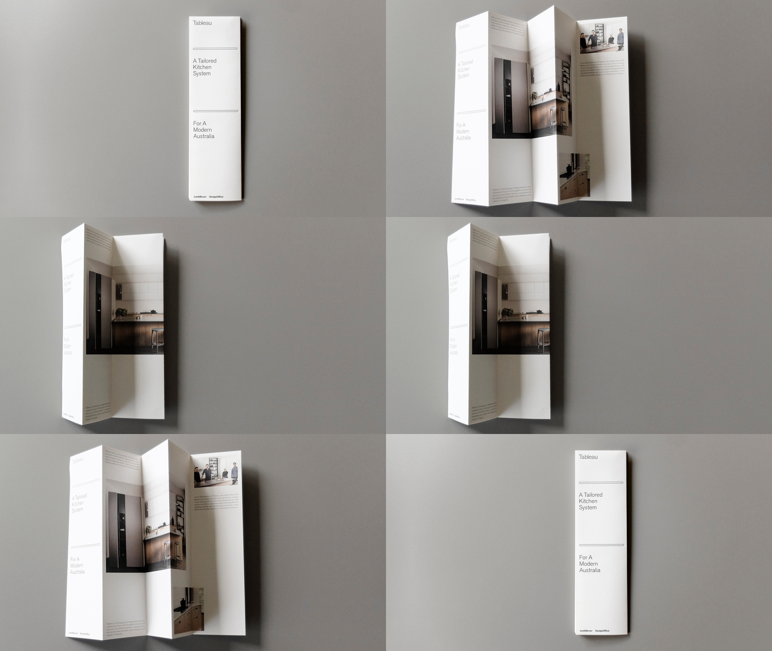
TCYK’s task was to create an elegant communication framework for Tableau that would allow someone outside the design industry, and perhaps new to Cantilever, to appreciate it organically. The brochure lingers over Tableau’s finer details, and unpacks some of the design thinking which allows the furniture-based pieces to work both individually and apart.
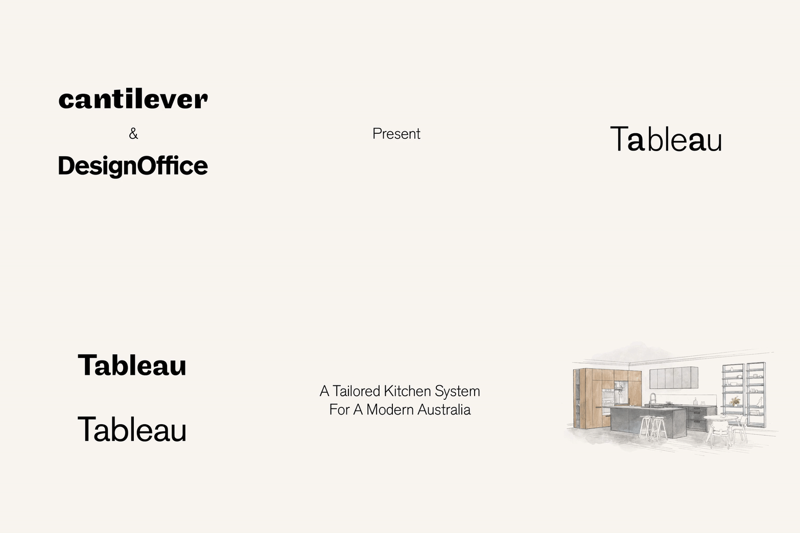
Tableau by Cantilever & DesignOffice
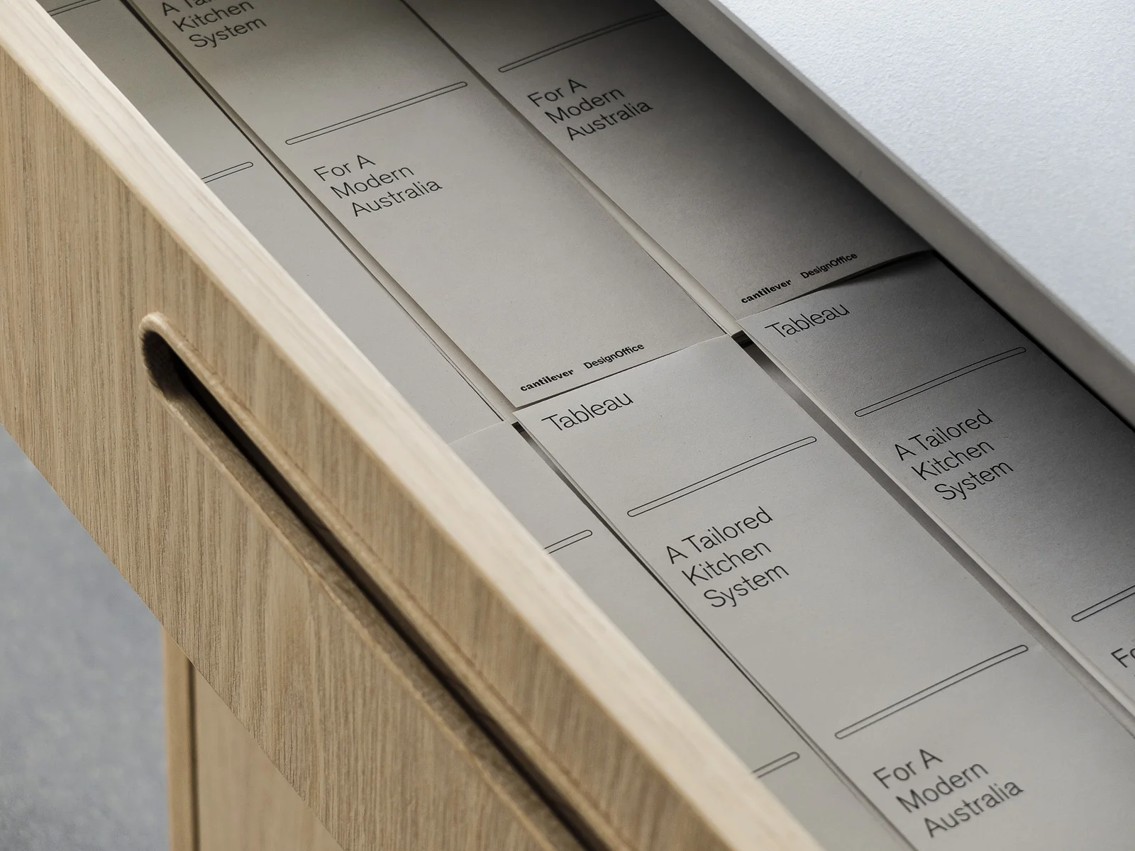
A Tailored Kitchen System For A Modern Australia
Key Brand Message
Brand Graphics designed by TCYK inspired by the handmade handle that is unique to the Tableau Kitchen System
The wordmark for Tableau was born from two fonts that capture a history personal to both Cantilever and DesignOffice.
Design Content
Courtesy of TCYK
The intent was that people would feel “like they’re being guided through a considered curatorial process, rather than being restricted to options,” in Rhys’ words. “It’s not a restriction, it’s a guiding of what works.”
In working with both DesignOffice and Cantilever, TCYK were able to implement a sophisticated, restrained design solution which accounted for the heritage of both parties while establishing an entirely new visual language for Tableau.
“It’s not just, ‘hey, let’s throw everything out and be this new thing here’. It’s more like, ‘what is the equity that we’ve built to get where we are? And then what is a clear path forward?’” explains Rhys. “So even though Cantilever haven’t been through a branding or graphic design process regularly, they move through a general design process quite regularly, and it allowed us to be quite detailed in the things that we were exploring.”
TCYK developed ‘Core, Complement and Complete’ as a way to distil the various intentions of Tableau into singular, easily digestible concepts, and also named each of its elements: Block, Bench, Shelf and Store.
“Even though those words seem very, very utilitarian and pragmatic, and obvious, there’s been a lot of behind-the-scenes stuff around that language, in how it all ties into what could be the next level for Cantilever,” says Rhys.
One eureka moment for TCYK was the discovery that DesignOffice’s current font and a previous Cantilever logo shared a font called Akzidenz-Grotesk. Thus, the Tableau wordmark became an amalgamation of Akzidenz-Grotesk, being DesignOffice, and Maple, Cantilever’s current font. Characters are merged together to make a unique set from both fonts.
“It speaks to the lineage of their past and future,” says Rhys. “They were honouring that.”


