In Perfect Harmony
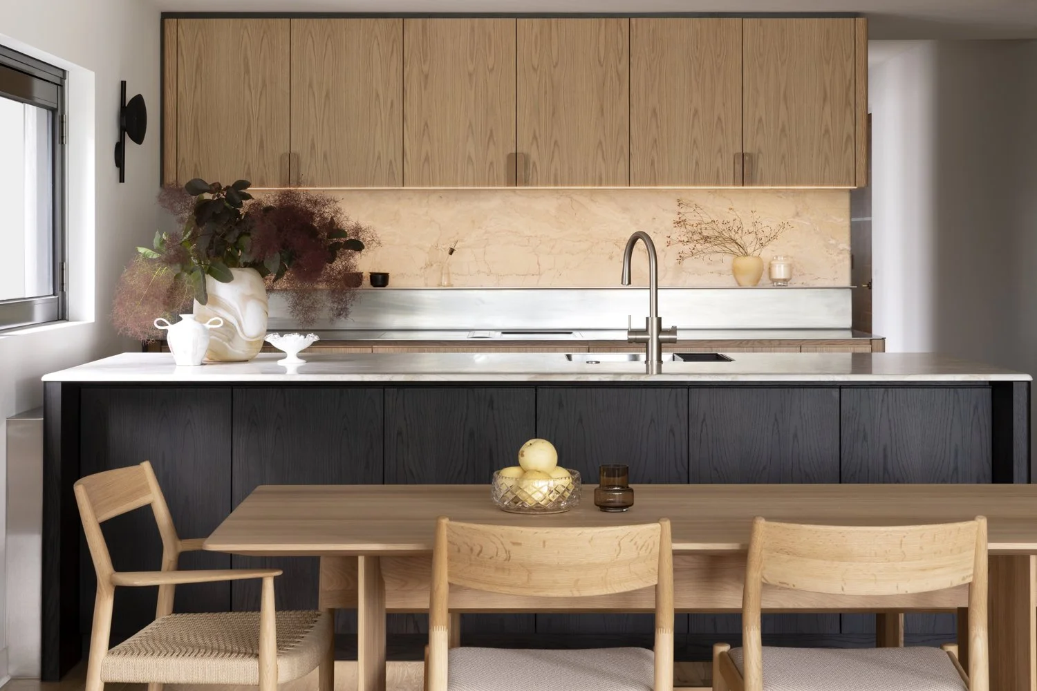
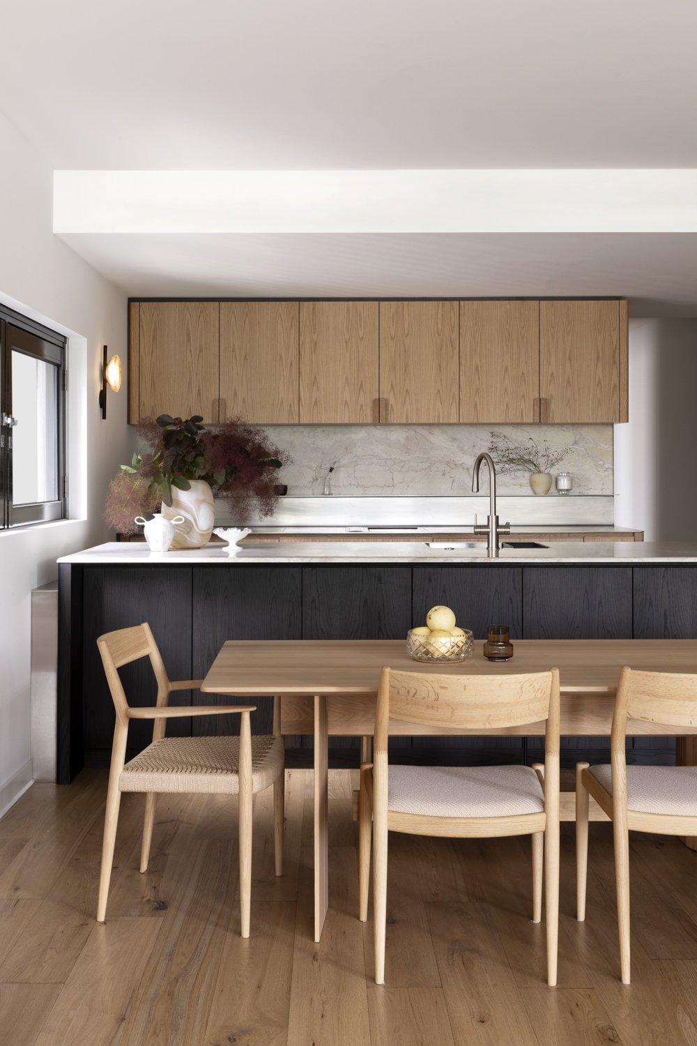
Each room in your home has its own purpose and atmosphere, yet a harmonious home considers how they feel collectively. Mark and Lyn, the owners of this South Yarra apartment, have achieved this harmony, through restrained use of colour, tactile finishes, a Japanese style influence, and a preference for Australian materials and craftmanship.
Project
Darling Street
System
EDIT Kitchen System
Service
Kitchen, Dining, Study, Robes +
Interiors Service
Location
South Yarra, Melbourne
Author
Carly Cleveland
Images
Martina Gemmola
Styling
Kylie Forbes
Key Suppliers
Apato
Make Designed Objects
Lytton DC Builders
Sheet Society
Mark and Lyn have an appreciation and expectation for quality, detail and function, this is obvious through their furniture choices, appliances and other selections within their home. And this was exactly what they were looking for when it came time to upgrade their apartment. With many projects, the Kitchen, as a primary daily focus that combines a high level of design function and a love of living; becomes the centre point of the renovation. “We had been looking at various European kitchens for some time but kept thinking that we must have similar craftsmanship and design available in Australia if we just looked hard enough.”
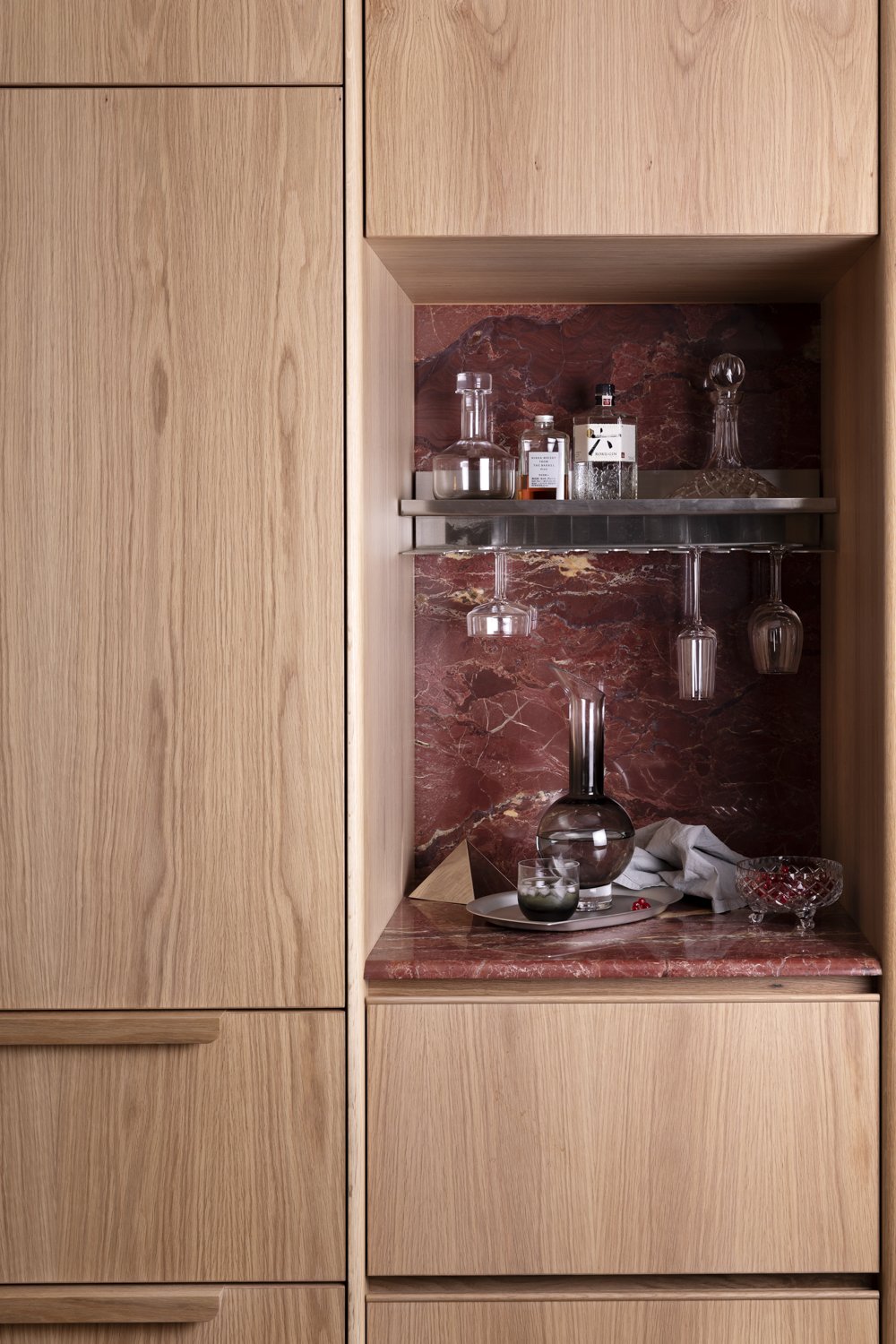
It was on a visit to Cosh Living’s showroom in Cremorne, that the couple discovered Cantilever's EDIT Kitchen System. “We were immediately attracted to the kitchen display setting that they had installed by Cantilever and loved the use of natural materials, along with stainless steel. The Australian Dolomite used in the bar nook was particularly eye-catching. We had found our local “artisans!”. Cantilever’s EDIT System captures a refined materiality, inspired by the unique character of our Australian landscape. It is a highly refined kitchen system that harnesses the craftmanship of our local industry. A great fit and alignment to the values and features that Mark and Lyn were looking for.
“We were immediately attracted to the kitchen display setting that Cosh had installed by Cantilever”
They made contact and quickly engaged Cantilever, to deliver the design and manufacture of the joinery updates needed in their apartment, including kitchen, study and robes in both guest and master suites. To compose the over-arching aesthetic, they chose to use Cantilever’s Interiors Service to create the overall specifications, colour scheme, mood and detailed design.
The project features Cantilever’s EDIT System throughout the home. Mark and Lyn worked with Cantilever’s Managing Director and Creative Director, Travis and Kylie on the designs, layout and palette for their home, regularly referring back (and visiting) the EDIT kitchen in Cosh, as a reference point and design inspiration. They were particularly impressed with the way EDIT used different timbers along with different stones, yet still achieved a design harmony overall. The quality of the cabinetry and fittings was also on the mark, “it was exactly what we were looking for”.
“Joinery in its nature intersects function, form and spatial planning. Our depth of experience across many projects, working within homes and renovations to best utilise space, functionally and visually, has informed our thinking toward holistic interior design” explains Kylie.
From single kitchen renovations to whole-home interiors, Cantilever’s Interiors Service defines a design path that reflects a re-interpretation of the aesthetic preferences of each client, the mood and feel of their home and the vision for transformation.
Our Interiors Service is informed by the clients Kitchen or Joinery Package according to their needs. Working with the client, Cantilever will develop a thorough Interior Palette that not only facilitates a consistent design language throughout the project, but also makes the selection process easier. A curated library of finishes and fixtures encompassing wall, floor and lighting treatments provides access to Cantilever’s industry knowledge and supplier network. We can include spatial planning, interior specification options including furniture, and documentation services as required by the project. The specific interpretation of the architectural bounds, and the Interior opportunities between surface, function, light and joinery, allow each project to become a unique expression of a resolved design language. Our Darling Street interiors project scope incorporated finishing and fixture selections, lighting treatments, and interior specifications.
“Our aim was to create a sophisticated environment, that spoke to the travels, appreciation of craftsmanship, and culture that Mark and Lyn evoked. Through a series of design meetings and site visits, we developed a design response that understood the functional and aesthetic values needed to satisfy them.”
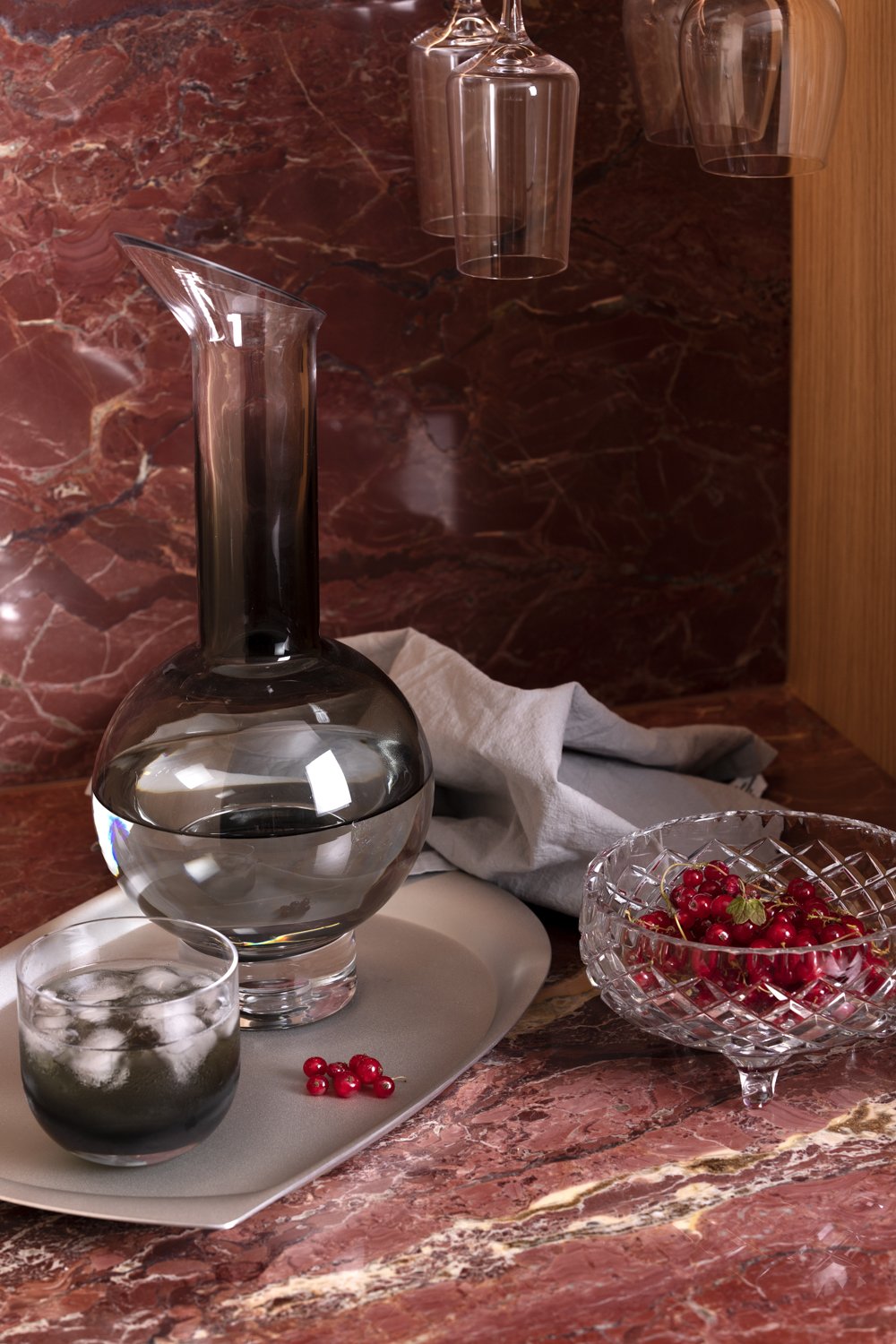
When it came to the stone selection for their kitchen, Mark and Lyn had already “fallen in love” with the red dolomite that they had seen in the EDIT display at Cosh Living. They particularly liked its connection with Australia and the land. The stone they loved was sourced from the Pilbara region in the remote northwest of Western Australia, this region is thought to be nearly 3.6 billion years old, and unique in the world. Here the forces of nature, heat and pressure have taken two billion years to form this unique natural stone, found nowhere else on earth, known as Pilbara Dolomitic Marble.
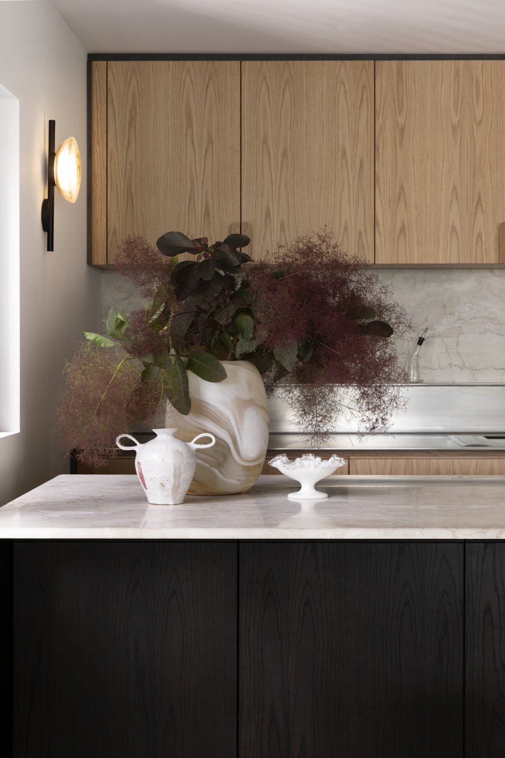
Within close proximity, four distinctly coloured dolomites have been created, two of which were used in the project; the Red Dolomite used in the Liquor Niche, and White Dolomite on the Island and Perimeter splashback. The connection to land, and acknowledgement of Indigenous land rights through title and rights, only makes the stone more precious.
“It was immediately obvious to us that we had our benchtop! The colours were just so evocative of the Australian landscape which we love”.
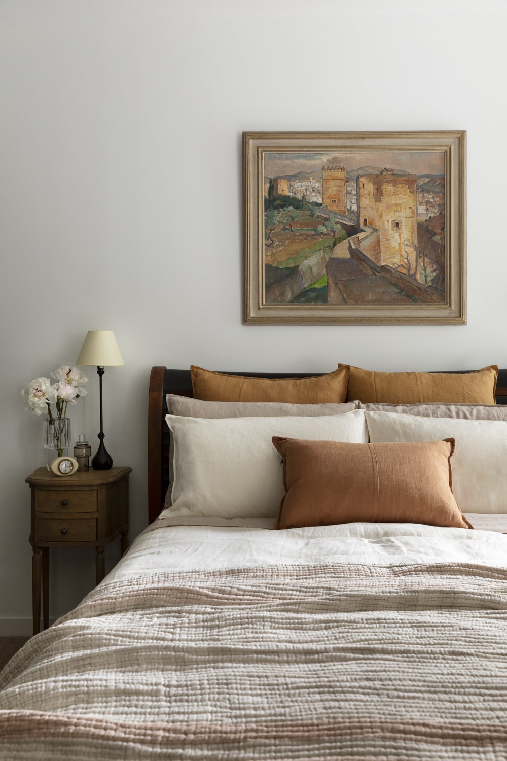
The colours featured in the Dolomite became somewhat of an inspiration source and muse for the project palette. With shades of cream and varying tones of brown and grey, featuring throughout the home, complimented by the rich tones of the timber. The restrained colour palette brings a relaxed and luxurious ambiance, and a harmony to the overall design.
“It was immediately obvious to us that we had our benchtop!”
As it would turn out Covid intervened with the project timeline, and the project took longer than expected. However, the couple used the time wisely. Taking the opportunity to fine tune the layout, especially the kitchen, from an ergonomic and functional point of view. They were able to plan each and every internal section, incorporating an inner drawer, under sink cady, a recycling bin system and much more.
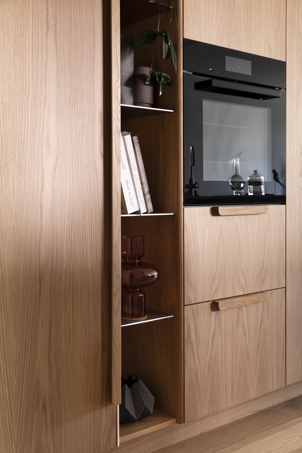
The additional time also allowed plenty of appliance research to be done, the couple settling on a Bora cooktop and downdraft, as they were unable to install an overhead system due to ceiling and ventilation restrictions that are common to apartments. They opted for an integrated Liebherr fridge for a streamlined look. The oven and dishwasher are Miele.
The lighting in the apartment required careful consideration, due to the common apartment issue of limited natural light. The aim was to deliver a soft, relaxing atmosphere, a welcome contrast to the previous bright overhead lighting. Ross Gardam lights were selected as features in both the kitchen and study, with integrated LED lighting used throughout the joinery to provide the opportunity for deliberate, task focused lighting. This reduced the reliance on sharp overhead lighting, allowing for feature lights to take place, and create the ambience needed to feel the subtle shift of daylight through the apartment. The outcome was a lovely natural feel to the lighting scheme.
“The beautiful solid timber profile desk edge and drawer finger pulls emphasizes the soft tactility of EDIT detailing”
The study originally felt like a sentence, devoid of inspiration. It needed a stroke of life, and so we incorporated a soft, warm palette with joinery that provided clear sensory pleasure. The beautiful solid timber profile desk edge and drawer finger pulls emphasizes the soft tactility of EDIT detailing. Paired with matte cork pinboard, floating timber shelf with LED lighting and benchtop detailed with tactile Forbo furniture vinyl, the soft hand feel confirmed the sense of luxury desired by the clients. A warm tonal palette increases the gentle warmth of the space, and creates a focused, timeless space.
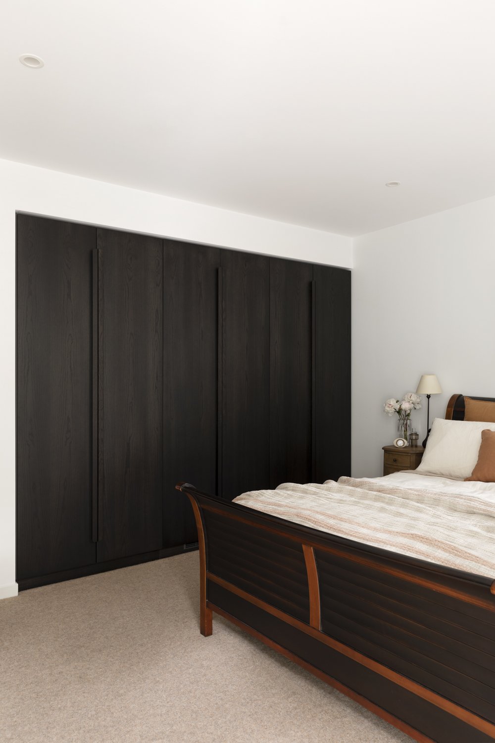
The wardrobe designs in both the guest bedroom and the master suite, focused on both functional and efficient storage, whilst maintaining the high-level detail and finish of EDIT joinery system. “We chose to use the charcoal finish, to allow contrast and tie to existing furniture pieces. The full-length solid timber handles provide ample registration, ease of use, and comfort at hand”, commented Kylie. The addition of wardrobe joinery to the EDIT system allows our clients to integrate the same level of quality and aesthetic throughout their home. Once again, internal LED lighting allows perfect visibility when in use. The design of accompanying pieces across the Master suite allowed for maximum storage efficiency and function. The simple relocation of a primary full-length mirror to allow the viewpoint to be light-filled and at a distance, via the accompanying ensuite, maximised the benefit of the spatial design and daily function, whilst providing a clean, streamlined look.
Kylie describes the approach, “We worked to incorporate considered function, a wholistic home palette and lighting, with thoughtful storage options and high-quality joinery work across the project. Though subtle, the architectural integration of the adapted interior design delivers clear and meaningful benefit to the daily lives and habits of our clients, which we are proud of.”
Mark and Lyn are well travelled and have a beautiful collection of furniture and unique pieces to show for their many trips. They have a particular fondness for Japan, where they have spent much time. This fondness is showcased in their home through various Japanese influenced objects on display and a love of Japanese designed furniture, some of their favourite pieces include their new dining table and chairs. Both sourced from Apato, a locally based retailer who brings to Australia the finest furniture brands by master craftsmen and designers in Japan.
As the project required various construction elements, Cantilever introduced Mark and Lyn to Richard of Lytton Construction, who is part of Cantilever’s Build Network. They were very happy with this introduction, “Richard immediately started to fill out the overall design with some great ideas especially around the oak flooring”.
The entire experience for the couple was positive, even with the Covid delays. “The combined team of Cantilever and Lytton gave us both a lot of confidence with our decisions”.
The apartment is the perfect home for two, a harmonious space. The beautifully soft colours and rich tactile materials coming together to create a timeless interior which showcases craftsmanship and attention to detail. “Everyone who worked on the project was great at their job and very engaged with us on all level of detail. We are both very happy with the outcome and combined with some lovely Japanese table and chairs from Apato in Richmond, we have an apartment that we love to come home to”.
To get started on a project of your own, drop us a line.

